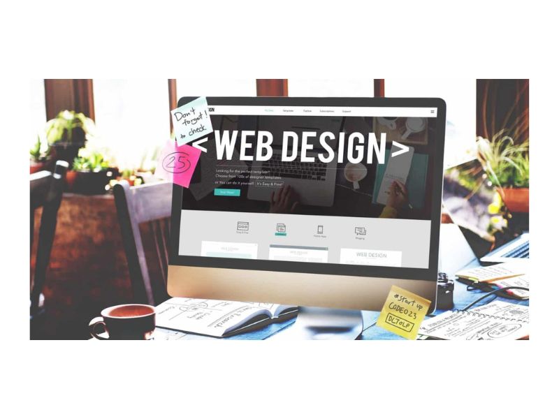
Choosing a web design that is suitable for your needs can take a lot of time. I intend to ease some of your burdens and provide you with some insight into the design layouts that are most effective for various company and personal website kinds. I will take you through elements of a basic and common design layout. In this article, we talked about how to choose a basic web design that is right for you.
Some people make the common mistake of jumping straight in and choosing colors and fonts, now I’m not saying this is a bad thing to do, however, this should be seen as a lower priority than other design elements. The main reason for this is, that if you needed to change the design colors and fonts at a later stage it would be a much easier task than changing the structural layout altogether. So it is a better idea to first focus on the overall layout of the design.
Choosing the design main regions
The best thing to start off with is selecting the main regions to be used in the design. To do this imagines your design to be colored sections or blocks (squares and rectangles) that have no content or images within. Start from the header and move down to the footer of your website. It can be helpful to sketch down these sections on paper to give you a better view of how everything is going to look at the end.
So let’s start with the header, you will need to decide whether or not you are going to have top navigation. If you decide to have one, placing it on the top right-hand side is recommended. Next would be to select an area to place a static header image or slideshow and finally where to place your company logo (the top left of your design is recommended as this is the first thing people will see when visiting your website). You can also add second top navigation under the header image if you have a large amount of content to upload. Make sure that you do not clutter your design as this will deter users and potential clients.
Once you have your favored header it is time to move down to the main content area of your website. This should be pretty straightforward forward but you may want to add a left or right navigation, once again only if you have large amounts of content. To reduce clutter you could possibly use expandable menus or drop-downs on your navigation. I would not recommend this for smaller personal websites.
If you are not adding extra navigation in your content area you could also use the space for promotional graphics. When using promotional graphics try not to make them too over the top as there is nothing worse than bright colors and big capitalized text. The best approach (if you really must add promotional graphics) is to use something fairly small and simple just enough to attract the attention of our visitors but not too much that they feel forced to click the graphic. Alternatively, you could just use static images to liven up the design.
Moving on to the footer of the web design. It is best to utilize this area by placing your main website and social media links here as well as any other additional links to specific areas. A popular practice is to section off the footer into 2-4 columns; this provides a clean look and can be styled quickly into many variations.
Choosing the right font for your design
Now you have the design layout in place it is time to select a nice readable font. When selecting the font for your paragraphs it would be wise not to use ‘Times New Roman’, most people find this font harder to read on a web page. Two good fonts that I use for paragraphs are ‘Arial’ and ‘Trebuchet’, ‘Arial’ being my personal favorite.
For the header text you can choose from many different fonts, some fonts I have used for headers are ‘Delicious’, ‘Opal’, ‘Arial’, ‘Rounded MT Bold’, and ‘Myriad Pro’. These headers can also be styled to the color theme of your design.
Choosing the right colors for your design
You probably have an idea of what colors you want to use already, although you may swap and change them around often to get the desired look and feel. This is a good thing to do as color picking can sometimes be a hard thing to get just right. Choosing the right colors for your design mainly fall on the profession of your business or personal service, using the right colors will portray the correct message to your visitors. For example, it would be best to use basic pastel colors for a barrister’s website and not bright vivid colors. In some instances, this may work depending on the design and its goals.
On a more personal selection, I have chosen to use blue and a touch of green on my website with various shades of black and white. Note that pure white usually works well on websites and gives a more spacious look but pure black is not as favored, it tends to have the same effect when trying to mix different colors of paint with black, all you end up seeing is the black! There are however a few websites where black has been used successfully.
When choosing colors for your web design san antonio is sure to only select around three of four main base colors and that your chosen colors gradually change from light to dark. You do not have to do this for every color but it does create a nice contrast when used correctly. It is also a good idea to base your website colors around that your company logo.
Taking each of the points above into account, you should now have a well-rounded web design. There are not many limitations when it comes to web design and this guide only really covers a basic design layout, although I am sure that using some of the recommendations I provided will help you when looking for the right design that suits your needs.
Tips To Improve Your Website
Know that it will take a lifetime to perfect your web design abilities. The issue is that this field has been developing quickly. We’re going to give you five web design pointers in this article to assist you to make your website stand out from the competition.
1. Remove the Clutter
Initially, you might want to check to see if your website is cluttered. As a result, you should check your designs to make sure they include all of the necessary components. You might wish to remove some of the elements if you believe they don’t enhance the overall user experience.
The number of pull-out menus shouldn’t be excessive. There are drop-downs and fold-outs. They are useful for clearing up clutter. Make sure that no menu has more than seven items, if at all possible.
2. Use Enough White Space
There will be plenty of empty space once all the junk has been removed. Negative space, often known as whitespace, can assist make the main subject and text more readable when handled properly. You should therefore leave some blank space around your most crucial components.
You might not want to add extra aesthetics at the expense of the layouts’ attractiveness, though. Additionally, you can use color and font to generate interest.
3. Use Visual Hierarchy
Different forms of visual features, such as positioning and scale, are referred to as having a visual hierarchy. For instance, you could put a large, bold title at the top of the page. On the other hand, you should present legal information at the bottom of the page in small type.
You could wish to create a website that is simple for people to scan. We are aware that the majority of website visitors scan rather than read entire pages. As a result, you might want to consider several options.
4. Choose the Best Colors
There are other details to take into account while creating a nice composition, such as color. To put it another way, you must establish a color hierarchy. For instance, you could want to utilize the same color for all of the elements—primary, secondary, and least important.
Aside from this, you might want to maintain the themes. When choosing a color scheme, be sure to stick with it. Ensure that your website’s major, secondary, and least significant colors are utilized consistently.
5. Use High-Quality Photos
Finally, you need to do things correctly if you wish to add actual photos to your website. Make sure the photos are useful and significant so you may use them to further your professional objectives. On your website, you should upload high-quality pictures.
Use real people’s images if at all possible. This is crucial if you want to keep website visitors interested. Similar to that, you can aim to create the ideal environment.
What next?
Send your design to your web designer to get things going! This will defiantly speed the development time up. Even if you do not have a full-blown web design, knowing where you want everything and what colors you want to use is still going to help. So what are you waiting for? Let your creativity flow!
Read More Articles